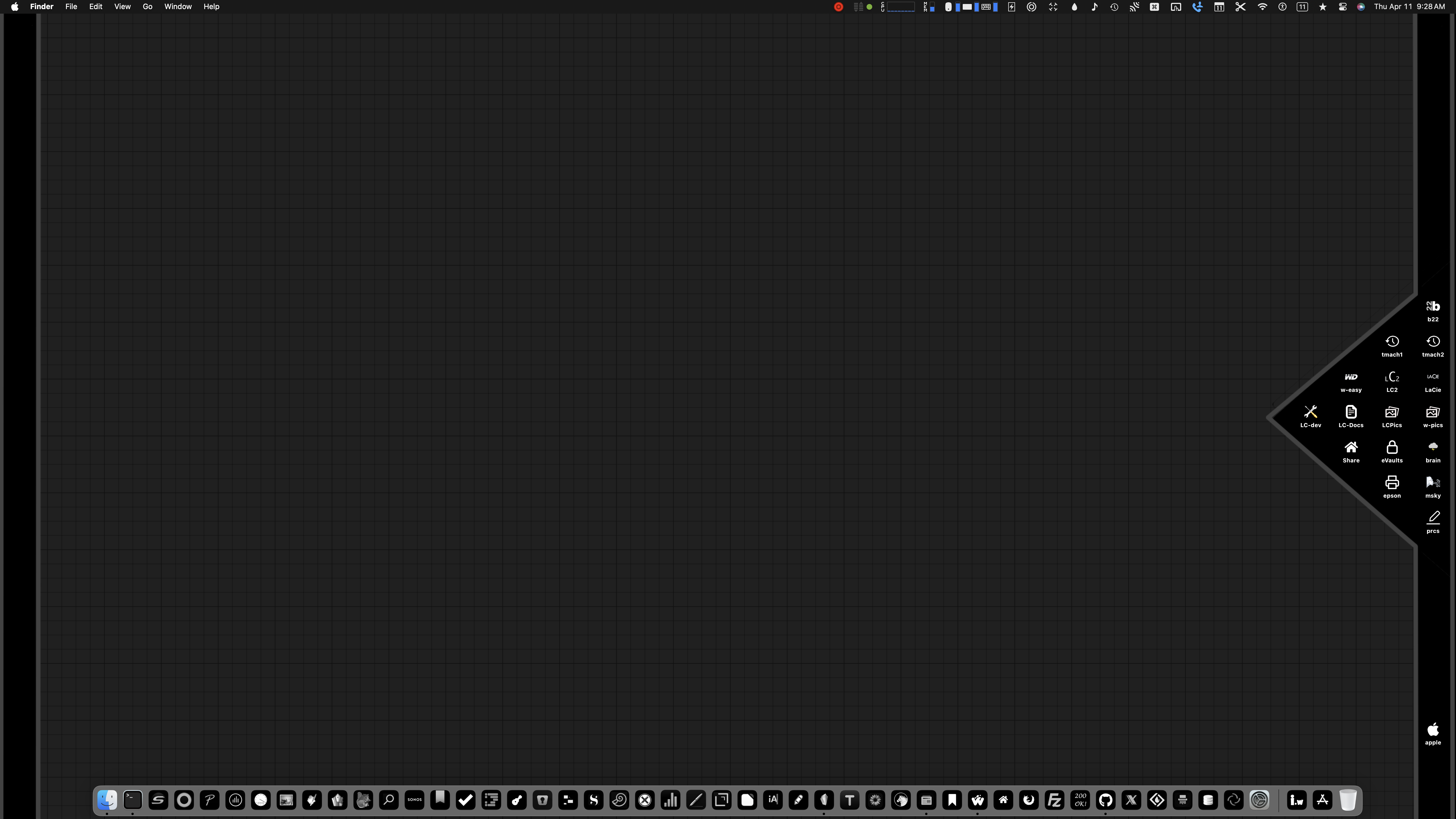
minimal black and white is my new jam
Version 4 | Version 3 | Version 2 | Version 1
 Since I revamped my desktop last year, I’ve revised it more than a few times. Playing with graphics is kinda like music to me. It’s a creative outlet that takes my mind to a different place - a perfect distraction!
Well. A few weeks back, I simplified my desktop and love it. I spend hours daily looking at my screens and this minimal b&w look on the main screen suits me well:
The icons for Apple’s built-in apps are tucked away in an easy-to-activate palette as changing those icons appears to be disallowed by the operating system. Though activating the palette brings a temporary burst of color to the desktop which looks nice against the b&w, I find myself quickly closing it to maintain the minimal feel (which makes me happy).
Cheers and thanks for visiting!


